


Introduction
Container controls are a misunderstood concept for many a new programmer. It is as if newbies do not realize the true power of a container control. Today I will set this record straight with this article and explain exactly what Container controls are, which Container controls are available, and how to use them
What are Container Controls?
Container controls, as their name implies, are controls that can host other controls inside them. The Form is the perfect example here, as you put all your controls on the form. The host is known as the parent, and the controls inside the host are known as the children. Container controls can obviously host other Container controls as well; then you’re looking at a grandparent, parent and child relationship.
Now that you know what a Container control’s purpose is, let’s start playing with them, one by one. You can find all of these controls bar one, in your Toolbox under the Containers section as shown in Figure 1.
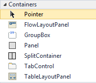
Figure 1 – Standard Container Controls
TabControl
The TabControl is very versatile. It allows for the capability to have multiple little screens of content, all separated into tabs. This means that instead of separating content into different forms, you could have one TabControl on one form, with all the desired information. Add a TabControl to your form. You will see that it resembles Figure 2.
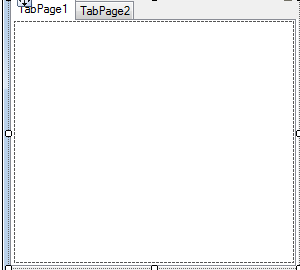
Figure 2 – An Empty TabControl
The TabControl has many Methods and properties, as shown here on this MSDN link. The Property to note is the TabPages property. This allows you to add, remove and edit the tabpages on the tabcontrol. In your Properties window, click on the TabPages Property. A screen similar to the following Figure will pop up.
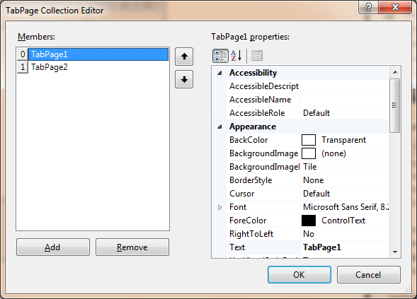
Figure 3 – TabPage Collection Editor
To add a tab, click on Add. To remove a tab, click Remove. To edit each Tabpage’s properties, use the Properties window inside this screen. To rearrange the order of the tabs, click on the up or down arrows respectively. Try to create a TabControl with the following tabs:
- Panel
- GroupBox
- FlowLayout
- SplitContainer
- TableLayout
- Toolstrip
If all went well, your TabPage Collection Editor should resemble Figure 4.
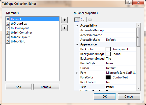
Figure 4 – TabPage Collection Editor with your tabs
Your Form will now display your TabControl along with its six new tabs. These tabs are all empty at this stage, as you have to add the content manually.
TabPage Navigation
Before I move onto the next topic, you have to know that navigation between tabpages is quite easy. You can click on each tab individually, or you can navigate through code. The following code will automatically navigate to the next tab. If the last tabpage is reached, it will continue again from the start. I also included code to navigate backwards in the same manner.
    Dim i As Integer

    Private Sub btnNext_Click(sender As System.Object, e As System.EventArgs) Handles btnNext.Click

        i += 1

        If i <= 5 Then

            tabContainer.SelectedIndex = i 'Jump to next tab page
        Else
            tabContainer.SelectedIndex = 0 'If end is reached, start over
            i = 0
        End If

    End Sub

    Private Sub btnPrev_Click(sender As System.Object, e As System.EventArgs) Handles btnPrev.Click

        i -= 1

        If i >= 0 Then

            tabContainer.SelectedIndex = i 'Jump to previous tab index
        Else
            tabContainer.SelectedIndex = 5
            i = 5
        End If
    End Sub
This code assumes you have two buttons named btnNext and btnPrev respectively. It increases or decreases the counter i (which is a modular variable), and sets the tabcontainer’s SelectedIndex to the value of the counter variable.
Panel
A Panel is the perfect container control. Why? Well, because of its simplicity and ease of use. The Panel not only serves as a container control, its main purpose is to help organize your controls on your forms better. An added benefit is that if you set its properties good enough, you will always maintain the same look and feel of your form irrespective of the form’s size.
All of the Panel’s methods and properties can be found on this MSDN link.
Make sure the first TabPage is selected on the form, then double click on the panel in your Toolbox. It should add the Panel inside the tabpage; if it doesn’t, just drag the panel onto the tabpage. Now we sit with a Container control inside a Container control. If the tabpage gets disabled or hidden from view, so will the panel with all its controls inside, as it inherits capabilities from its parent control. Add a couple of controls inside the panel. Mine looks like Figure 5.
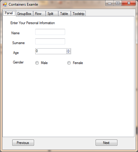
Figure 5 – Populated Panel Control
If you were to write this code:
Panel1.Enabled = Not Panel1.Enabled
It will Disable the panel and all the controls it contains if clicked once. If clicked again, the Panel and all its children will become Enabled again. This works because of the Not keyword. First it makes the statement False, then it makes the statement True. This logic applies to all Container controls, so later, you could perhaps experiment further.
Another great use for a panel control is to organize the input fields according to their purpose. If you look at the above example, you can clearly see that I have put controls on this panel to be used as a Personal Information form. You could add another panel and add Educational Info, or Work Info and put all their respective fields inside them. The caveat here is that you will end up with one big form with lots of different sections. But you get the idea, don’t you?
GroupBox
The GroupBox is the perfect control to use when you have to separate different controls based on their purpose for your app. Remember what I talked about in the previous paragraph? Well, this is where the GroupBox is handy. Granted, you may still end up with a huge form, but it will look well structured, and very few people will complain. What makes the GroupBox so special is the fact that it includes a nice little frame around it and includes a heading.
GroupBox properties and Methods can be found here.
Make sure the second TabPage (GroupBox) is selected, then double click on the GroupBox control in the Toolbox. This should add the GroupBox to the tabpage. Once the GroupBox has been added, add the necessary controls inside it to resemble Figure 6.
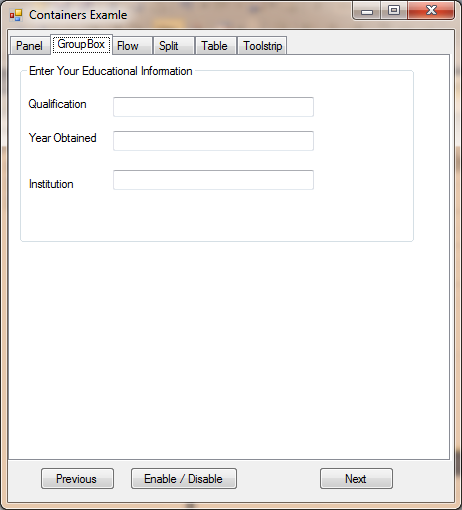
Figure 6 – Populated GroupBox control
Notice the frame and the caption? This is what differentiates the GroupBox from its peers.
In my line of work, I get asked a lot of questions by my students. One popular question is: “How to make an expandable GroupBox?” This means that some GroupBoxes have a little + sign or – sign next to the Caption. This indicates that you can increase or decrease its size dynamically. Sadly, this is not a built in feature, so you will need to make your own custom control (for more information on custom controls, have a look here). Have a look at this very old article of mine creating a custom GroupBox that can expand its contents.
FlowLayoutPanel
The FlowLayoutPanel shares many of an ordinary panel control. They ultimately serve the same purpose, which is to organize children controls. The FlowLayoutPanel however, took it one step further. This step is the inclusion of the FlowDirection property, which has four possible settings :
- LeftToRight
- TopDown
- RightToleft
- BottomUp
I will show how each one of these settings differ shortly. In the meantime, have a look here to find out about the other properties and methods of the FlowLayoutControl.
Select the third Tab of your tabcontrol in your project and add a FlowLayoutPanel to it. Once done, design the rest of the Panel to resemble Figure 7.
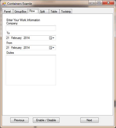
Figure 7 – Populated FlowLayoutPanel
I got this effect with the TopDown FlowDirection property setting. The next few figures show the same content with different FlowDirection settings.
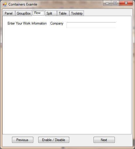
Figure 8 – FlowDirection : LeftToRight
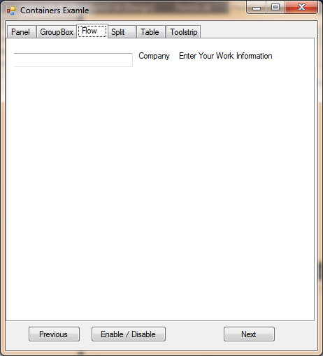
Figure 9 – FlowDirection : RightToLeft
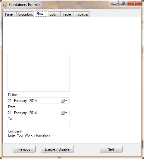
Figure 10 – FlowDirection : BottomUp
It should be quite clear that you absolutely have to plan your design beforehand, because the FlowLayoutPanel control can become quite tricky to design, as shown in the above figures.
SplitContainer
A SplitContainer is simply two Panels next to each other, separated by a Splitter. A Splitter is found everywhere. In Microsoft Excel, you can use the Splitter to create two separate screens out of one screen. The Panels inside the SplitContainer can be either Vertical or Horizontal. The Splitter itself is not really visible during run time, so at design time, a SplitContainer might look like Figure 11.
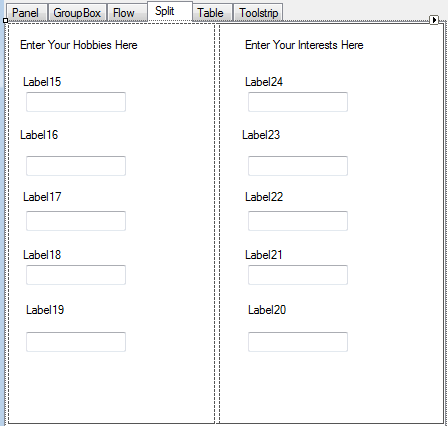
Figure 11 – SplitContainer Design
The line in the middle is the splitter, which obviously splits the two Panels. Here are some of the SplitContainer’s new properties:
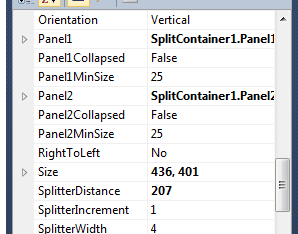
Figure 12 – SplitContainer Splitter Properties
For a full list of properties and methods for the SplitContainer, have a look here.
This is what a SplitContainer looks like when run and the Orientation has been set to Vertical:
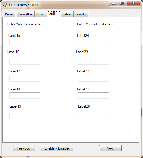
Figure 13 – Vertical Orientation
This is what Horizontal looks like:
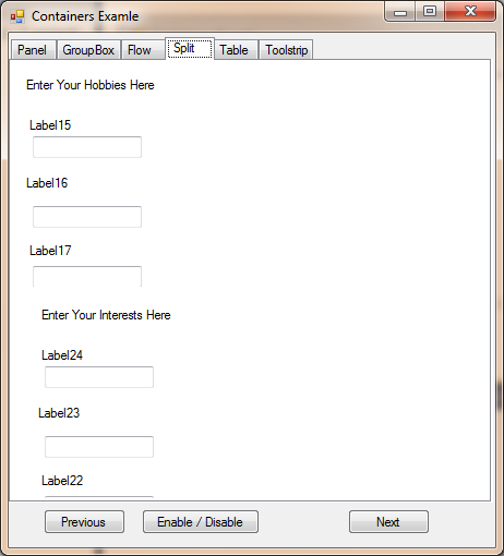
Figure 14 – Horizontal Orientation
TableLayoutPanel
If you have never heard the term “Table” before, let me explain. A table consists of rows and columns, similar to Microsoft Excel. The Rows are the horizontal blocks, and the Columns are the Vertical blocks. Now, a TableLayoutPanel allows us to add more rows and columns to provide a nicely organized view. It can get quite cumbersome to arrange all the desired controls so that they all line up or align nicely. This I use quite frequently, because my mouse sometimes has a mind of its own, and I use my mouse with my left hand instead of my right hand, due to injury.
To find all the TableLayout’s properties and methods, have a look here.
Properties worth mentioning are the Rows and Columns properties. Once clicked on in the Properties window, a screen similar to Figure 15 will pop up. This screen allows you to set the width for each row or column, as well as the ability to Add and Delete rows or columns.
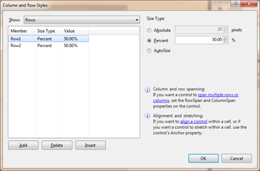
Figure 15 – Column and Row Styles
An example 2 x 2 table gives this result during run time:
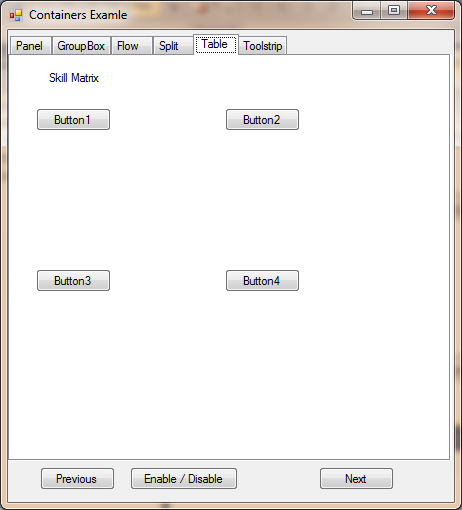
Figure 16 – Two Rows, Two Columns
ToolstripContainer
The ToolstripContainer is not found among the other Container controls, because it is more standard. Find it in your toolbox and play around with it. It is simply used to group desired Toolstrips together. Here is a link to all its properties and methods.
Other controls that also needs a mention:
Conclusion
This concludes today’s article about Container controls. I hope you have enjoyed it, as much as I have. Until next time, cheers!