


One gets so lost in all that is complicated that you tend to forget the basics. Recently, I had to make use of checkboxes in a project, and I forgot something simple. I suppose it depends on how much you work with certain controls, or in my case, age might be a factor…
Today, I would like to start a series of articles dealing with the basic controls, especially for beginners. The first topic I decided to cover is Checkboxes, so let’s get started.
What Is a Checkbox?
A checkbox allows you to make a binary choice between mutually exclusive options. Usually, a form supplies multiple questions from which you could choose. Examples could be: a list of extras to be ordered for a pizza, or a list of additional settings for a certain feature. A perfect example is the Font screen inside Microsoft Word. This is shown in Figure 1.
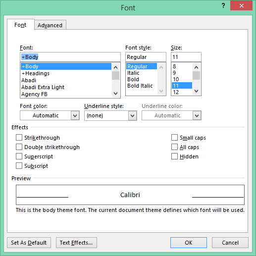
Figure 1: Font Screen
You can select any combination.
When a checkbox is selected, it shows a checkmark inside it. This can mean “yes” or “true.” When nothing is selected, the checkbox is empty; this can mean “no” or “false” for example.
Using the Checkbox
Obviously, you first need to create a Windows Forms application and have at least one form. When the form has loaded, you can have a look in the toolbox for the Checkbox. The Toolbox is shown in Figure 2.
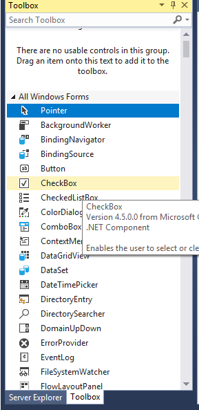
Figure 2: Toolbox
Once the Checkbox has been added, you may notice the Properties window, as you can see in Figure 3. This is where we set the Checkbox’s properties.
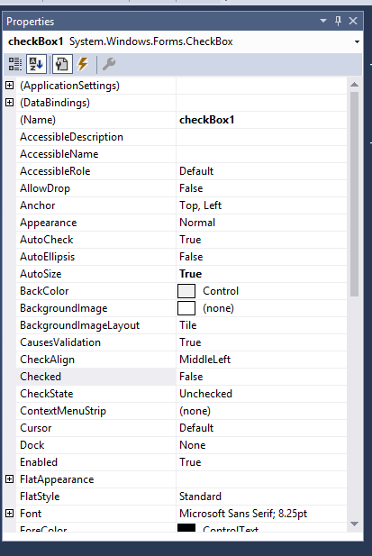
Figure 3: Properties Window
Apart from the ordinary properties, such as Name, Text, Enabled and so on, here are a few cool properties to look out for.
Cool Checkbox Properties
The following properties, described in the following sections, control how the Checkbox work and how it appears:
- Appearance
- ThreeState
- Checked
- CheckState
Appearance
The Appearance property has two options:
- Normal: Normal displays the Checkbox as a Checkbox. When selected, it displays a check inside.
- Button: Button displays the Checkbox as a button. When selected it shows the button as highlighted. This is shown in Figure 4.
Figure 4: Checkbox Appearance
ThreeState
The ThreeState property provides another checked option for the Checkbox. Whereas a normal checkbox has either an empty state or a checked state, a ThreeState checkbox has both, represented by an empty block, or a checkmark as well as a little square.
These types of Checkboxes are usually used when no options in a group of checkboxes are selected. Figure 5 shows what it looks like.
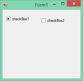
Figure 5: ThreeState checkbox
Checked
The Checked property of a checkbox determines if the checkbox is checked or not. You also can use the Checked property to set the checkmark yourself.
When it is Checked, the Checkbox displays a check mark. However, if the Appearance property is set to Button (as explained earlier), it will appear sunken when Checked, and raised when false.
You can use the Properties window to set the Checked property to true, or through code.
To set the Checked property using code, type the following code in a button’s click event, for example:
   private void button1_Click(object sender, EventArgs e)
   {
      if (checkBox1.Checked)
      {
         MessageBox.Show("Checked");
         checkBox2.Checked = false;

      }
      else
      {
         MessageBox.Show("Unchecked");
         checkBox2.Checked = true;
      }
   }
This code checks if checkBox1 is Checked or not. Depending on whether or not checkBox1 is checked, checkBox2 gets checked and unchecked.
CheckedState
The next code alternates between the ThreeState values of true and false. If ThreeState is true, another checked option appears. This is known as an intermediate state.
      if (!checkBox1.ThreeState)
      {
         checkBox1.ThreeState = true;

      }
      else
      {
         checkBox1.ThreeState = false;

      }
Conclusion
I hope this article has shed some light on how to use the Checkboxes. In the next part, I will be speaking about Radiobuttons, so hang around and until then. Cheers!