


Sometimes, a standard control isn’t enough. There might be a situation where you need to make a custom ComboBox or extend it to add more functionality to it. Today, you will learn how to create a ComboBox capable of displaying images next to its list items.
What Is a ComboBox?
A ComboBox is a combination of a drop-down list and an editable textbox. It provides a drop-down arrow for you to click and choose from the list of items displayed. Some ComboBoxes allow you to enter text into its TextBox, assisting you with item selection.
What Is a User Control?
When you need to create a new control, the best way is to create a User Control. A User Control is a custom control that is built from scratch. Usually, User Controls do not have similar functions to standard controls. Another benefit of creating a User Control is that you can implement it more than once in a project; remember, a User Control functions the same way as all standard controls, only with custom design and function.
What Are Composite Controls?
Composite Controls are User Controls that combine one or more control into one function. This means that you take one control and extend its capabilities by adding either another full control, or its functionality. An example of a good Composite control would be an ImageCombo. This combines the methods of an ImageList Control into a ComboBox control.
Our Projects
The aim of the projects that you will create today is to create an ImageCombo along with its associated Properties and Methods. Also, you will create a Demo application where you can see your ImageCombo in action.
Project 1: Creating the ImageCombo Composite Control
Start Visual Studio and create a new C# Class Library project, as shown in Figure 1.
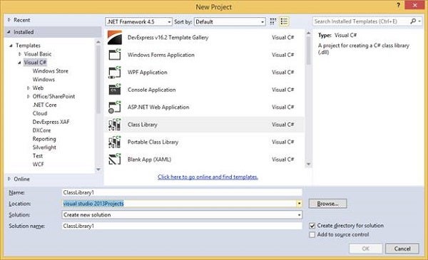
Figure 1: Class Library
There is no Design needed; everything will be created through code. You can, however, give your component class a better name. I have named mine HTG_ImageCombo, but feel free to name yours anything you please. You also may rename the newly created component to anything descriptive. I have named mine clsHTG_ImageCombo.
Open the code window for your component and add the following Namespace declarations:
using System;
using System.Drawing;
You will use the System and Drawing functions throughout the project. Make sure that your class inherits from ComoBox; for example:
public class clsHTG_ImageCombo: ComboBox
Now, your component already has ComboBox features, and you can extend them.
Add the following code into your class:
   private ImageList lstImages = new ImageList();

      public ImageCombo()
      {

         this.DrawMode = DrawMode.OwnerDrawFixed;

      }

      public ImageList ImageList
      {

         get
            {

               return lstImages;

            }

         set
            {

               lstImages = value;

            }
      }
You create an ImageList object and its associated property. This object will accept the images that you will insert into this component. In the Constructor, you set the Drawing mode of this object so that you are able to extend its capabilities. Add the next piece of code:
      protected override void OnDrawItem(DrawItemEventArgs e)
      {

         e.DrawBackground();
         e.DrawFocusRectangle();

         if (e.Index < 0)

            e.Graphics.DrawString(this.Text, e.Font,
               new SolidBrush(e.ForeColor), e.Bounds.Left +
               lstImages.ImageSize.Width, e.Bounds.Top);

         else
         {

            if (this.Items[e.Index].GetType() ==
               typeof(ImageComboItem))
            {

               ImageComboItem icItem = (ImageComboItem)
                  this.Items[e.Index];

               Color forecolor = (icItem.ForeColor !=
                  Color.FromKnownColor(KnownColor.Transparent)) ?
                  icItem.ForeColor : e.ForeColor;

               Font font = icItem.Indicate ? new
                  Font(e.Font, FontStyle.Bold) : e.Font;

               if (icItem.ImageIndex != -1)
               {

                  this.ImageList.Draw(e.Graphics, e.Bounds.Left,
                     e.Bounds.Top, icItem.ImageIndex);

                  e.Graphics.DrawString(icItem.ItemText, font,
                     new SolidBrush(forecolor), e.Bounds.Left +
                     lstImages.ImageSize.Width, e.Bounds.Top);

               }
               else

                  e.Graphics.DrawString(icItem.ItemText, font,
                     new SolidBrush(forecolor), e.Bounds.Left +
                     lstImages.ImageSize.Width, e.Bounds.Top);

               }

            else

               e.Graphics.DrawString(this.Items[e.Index].ToString(),
                  e.Font, new SolidBrush(e.ForeColor),
                  e.Bounds.Left + lstImages.ImageSize.Width,
                  e.Bounds.Top);

            }

            base.OnDrawItem (e);
      }
The OnDrawItem method gets used to draw strings in a custom manner. This gives the option of changing the text’s color, the text’s font, as well as to create space for a potential image item. Inside this method the ImageComboItem class gets initiated; let’s create it now:
After you have added a class for the ImageComboItem, add the following namespaces:
using System;
using System.Drawing;
Ensure your class (whatever it is named) inherits from the object. An example is shown next:
public class ImageComboItem : object
Add the following members to your class:
      private Color clrForeColor =
         Color.FromKnownColor(KnownColor.Transparent);

      private bool blnIndicate = false;

      private int intIndex = -1;

      private object objTag = null;
      private string strText = null;
These set the colors, index, and text for the ImageCombo items. blnIndicate will determine which list item has been selected. Add the following properties:
      public Color ForeColor
      {

         get
            {

               return clrForeColor;

            }

         set
            {

               clrForeColor = value;

            }

         }

         public int ImageIndex
         {

            get
               {

                  return intIndex;

               }

            set
               {

                  intIndex = value;

               }

            }

            public bool Indicate
            {

               get
                  {

                     return blnIndicate;

                  }

               set
                  {

                     blnIndicate = value;

                  }

            }

            public object Tag
            {

               get
                  {

                     return objTag;

                  }

               set
                  {

                     objTag = value;

                  }

            }

            public string ItemText
            {

               get
                  {

                     return strText;

                  }

               set
                  {

                     strText = value;

                  }

            }

            public override string ToString()
            {

               return strText;

            }
Add the following methods. They all have the same name, but different signatures. This will enable you to insert items into the ComboBox in many different ways. These ways include: text only, Text and image, text, and image and colors:
      public ImageComboItem()
      {
      }

      public ImageComboItem(string Text)
      {
         strText = Text;
      }

      public ImageComboItem(string stText, int intImageIndex)

      {
         strText = stText;
         intIndex = intImageIndex;

      }

      public ImageComboItem(string stText, int intImageIndex,
         bool blnIndi)
      {

         strText = stText;

         intIndex = intImageIndex;

         blnIndicate = blnIndi;

      }

      public ImageComboItem(string stText, int intImageIndex,
         bool blnIndi, Color clForeColor)

      {
         strText = stText;

         intIndex = intImageIndex;

         blnIndicate = blnIndi;

         clrForeColor = clForeColor;

      }

      public ImageComboItem(string stText, int intImageIndex,
         bool blnIndi, Color clForeColor, object oTag)
      {

         strText = stText;

         intIndex = intImageIndex;

         blnIndicate = blnIndi;

         clrForeColor = clForeColor;

         objTag = oTag;

      }
Project 2: ImageCombo Implementation
After you have Built your component, it will have produced a .dll file. This is the component you can use in ordinary applications and use just as a normal tool. Create a new Windows Forms application.
Add a Reference to your component you have created earlier, as shown in Figure 2.
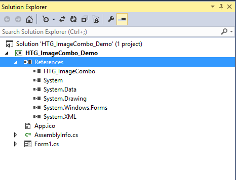
Figure 2: Add Reference
Design your Form to resemble Figure 3:
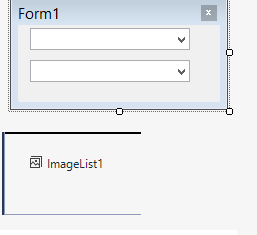
Figure 3: Design
For the ImageList, you may use any pictures. My ImageList is displayed next:
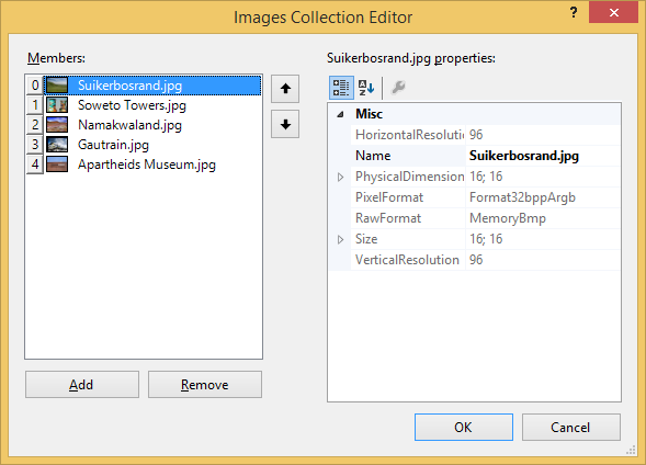
Figure 4: Example ImageList
These images are places (in South Africa) from my bucket list that I have visited recently.
Add the following code for your Form’s Load event:
private void Form1_Load(object sender, System.EventArgs e)
{

   ImageCombo1.Items.Add(new ImageComboItem("Select an Item", -1));
   ImageCombo1.Items.Add(new ImageComboItem("Item1", 0));
   ImageCombo1.Items.Add(new ImageComboItem("Item2", 1, true));
   ImageCombo1.Items.Add(new ImageComboItem("Item3", 2, false,
      Color.Red));
   ImageComboList1.Items.Add(new ImageComboItem("Item4", 3));

   ImageComboList1.Items.Add(new ImageComboItem("Select an Item",
      -1));
   ImageComboList1.Items.Add(new ImageComboItem("Item1", 0));
   ImageComboList1.Items.Add(new ImageComboItem("Item2", 1, true));
   ImageComboList1.Items.Add(new ImageComboItem("Item3", 2, false,
      Color.Green));
   ImageComboList1.Items.Add(new ImageComboItem("Item4", 3));

   ImageCombo1.SelectedIndex = 0;
   ImageComboList1.SelectedIndex = 0;
}
The preceding code simply demonstrates how to use the ImageCombo that you created earlier.
With this article, you can find two different attached zip files. One allows you to create an ImageCombo along with its associated Properties and Methods. The other creates a Demo application where you can see your ImageCombo in action.
Conclusion
Extending any control’s capabilities isn’t as difficult as it looks, thanks to the .NET Framework, which is structured in such a way to assist us in making things easier.