


Introduction
At Build 2013, Microsoft announced details about Windows 8.1, the successor to the Windows 8 operating system. It was announced that more than 5000 new APIs will be introduced in Windows 8.1. One of the new features being introduced is the Flyout control, which allows the application to show temporary information related to the current user interaction.
Flyout Control Basics
The Flyout control is meant to show information related to the current user interaction. The content can either be informational or one that needs user input.
The Flyout control can be dismissed by clicking outside it, if it is informational.
It can also ask a user to conduct an action, e.g., asking a user to click a confirm button to confirm that an order should be placed.
In the XAML world, the Flyout control resides in the Windows.UI.Xaml.Controls namespace in the Flyout class. In the WinJS world, the Flyout control resides at WinJS.UI.Flyout namespace.
The Flyout control is commonly to be used in conjunction with the button, so by default, the new Button class in Windows 8.1 has a Flyout property to specify if a Flyout needs to be attached to the Button or not.
Flyout control can also be attached to other FrameworkElement controls by using the FlyoutBase.AttachedFlyout property. For these controls, the Flyout control is activated by invoking the code in one of the control’s events (a classic example is the Tapped event).
Hands on with a XAML Based Flyout Control
We will now create a simple Windows 8.1 application with three Flyout examples:
- The 1st Flyout example will be a simple informational Flyout.
- The 2nd Flyout example will be typing a Flyout control to a non-Button FrameworkElement control; in our case, we will attach it to the radio button.
- The 3rd Flyout example will be a Flyout that needs user interaction; in our case, we will ask the user to confirm an order and then display success by showing a blurb in a TextBlock.
Open Visual Studio 2013 and create a new C# Windows Store application using the Blank App template. We will call our application Windows8.1FlyoutDemo.
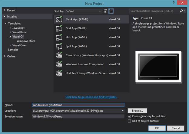
Visual Studio 2013: New Project
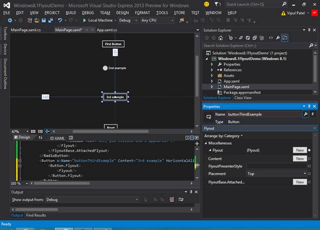
Next, we will open MainPage.xaml and add a few controls as shown below: a button control titled “First Example”, a radio button titled “Second Example”, a button titled Third Example, a text block containing no content, and a button titled Reset.
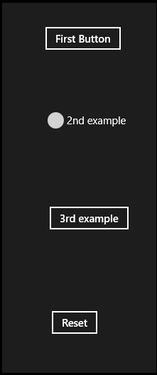
MainPage.xaml
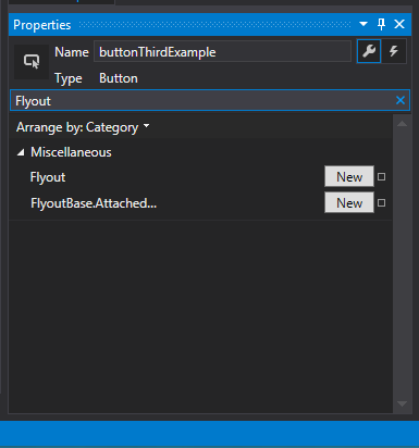
Next, select the button titled “First Button” and go to the properties and type “Flyout” in the search box.
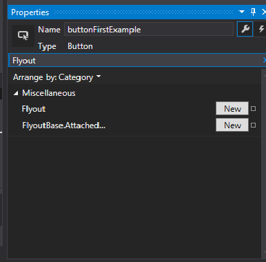
First Button Properties
You will see two properties called “Flyout” and “FlyoutBase.Attached…” appear.
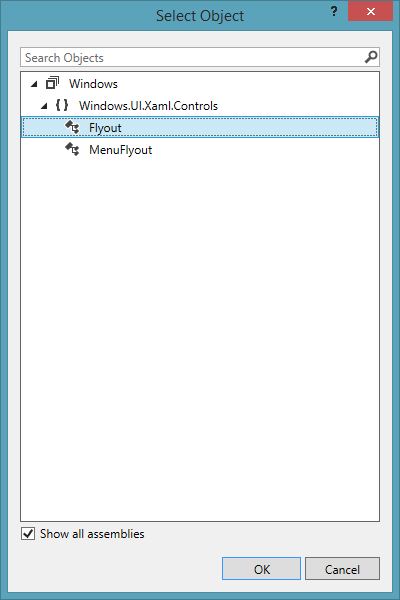
Click on the New button to the right of the Flyout property for the button.

Select Object
Select Flyout from the available controls and click OK.
Now, the Flyout has been added. You can confirm this by looking at the XAML created.
<Button x:Name="buttonFirstExample" Content="First Button" HorizontalAlignment="Left" Margin="542,134,0,0" VerticalAlignment="Top">
            <Button.Flyout>
                <Flyout/>
            </Button.Flyout>
        </Button>
You will also notice that the properties window has new properties displayed.
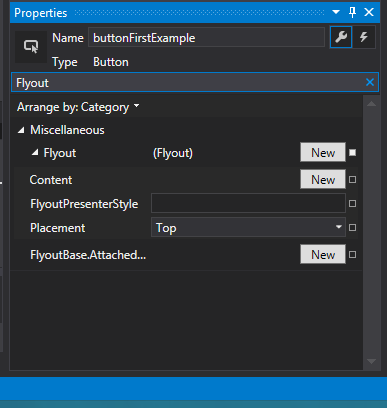
Properties Window
Click on the “New” button next to the Content property.
Select/Type TextBox and click OK.
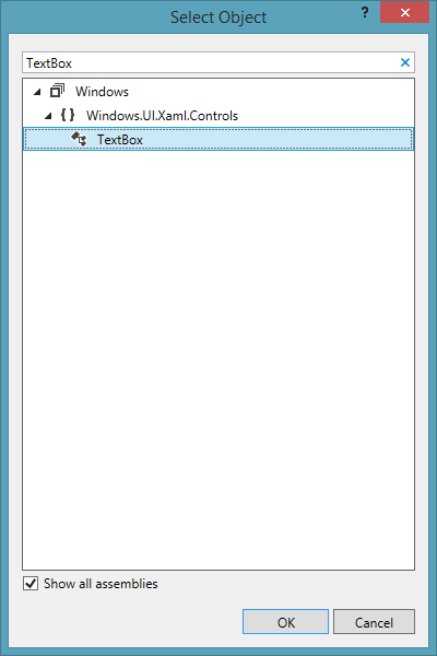
Select TextBox
You will see that all the properties of the TextBox now appear in the Properties window. Scroll down to the Text property and set it to “This is an informational flyout. Click outside to dismiss”.
Your XAML for “First Example” will look like:
<Button x:Name="buttonFirstExample" Content="First Button" HorizontalAlignment="Left" Margin="542,134,0,0" VerticalAlignment="Top">
            <Button.Flyout>
                <Flyout>
                    <TextBox Text="This is an informational flyout. Click outside to dismiss"/>
                </Flyout>
            </Button.Flyout>
        </Button>
Our simple informational Flyout control is ready. You can run the application now to see how the Flyout appears.
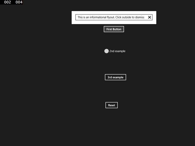
The Flyout
Next, we will add a Flyout to the Radio Button titled “2nd example”.
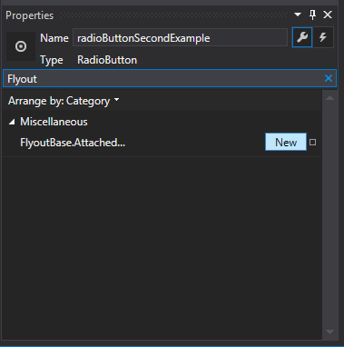
For this, select the Radio Button and in the properties window, search for Flyout.
Click the “New” button next to the “FlyoutBase.Attached…” property.
Click the New Button
Select Flyout and click OK.
Select Flyout
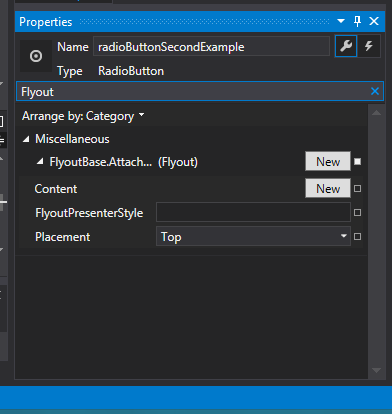
Click on the “New” button next to the Content property of the Flyout.
Select the New Button
Select TextBox and click OK.

Select the Textbox
Scroll down to the Text property and set it to “See, you clicked and I appeared.”
Your XAML for “Second Example” is below.
<RadioButton x:Name="radioButtonSecondExample" Content="2nd example" HorizontalAlignment="Left" Margin="545,254,0,0" VerticalAlignment="Top">
            <FlyoutBase.AttachedFlyout>
                <Flyout>
                    <TextBox Text="See, you clicked and I appeared."/>
                </Flyout>
            </FlyoutBase.AttachedFlyout>
        </RadioButton>
Now, we need to add code to invoke the flyout when the radio button is tapped. For that, we will click on the radio button and in the Properties window we will click Events and scroll down to Tapped event and double click it.
Click Tapped Event
In the event handler for the Tapped event for the radio button, we will add code to invoke the Flyout.
private void radioButtonSecondExample_Tapped(object sender, TappedRoutedEventArgs e)
        {
            FrameworkElement element = sender as FrameworkElement;
            if (element != null)
            {
                FlyoutBase.ShowAttachedFlyout(element);
            }
        }
Our second Flyout is also ready. Run it and see it in action.
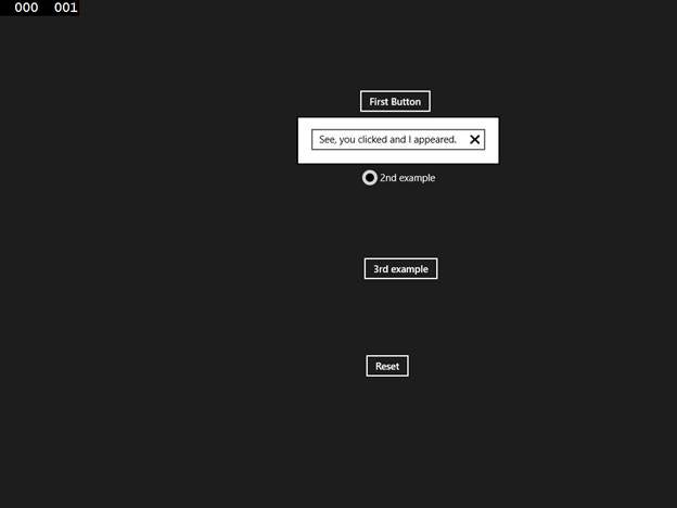
Second Flyout
Now, we are ready for the 3rd Flyout example. Here we will add the flyout as we did before in example 1. However, instead of adding a textbox, we will add a stackPanel.
Properties
Click New button next to Flyout property.
Select Object
Select Flyout and click OK.
Next, click New next to the Content property of the Flyout.
Click New Next to the Content Property of the Flyout
And select StackPanel and click OK.
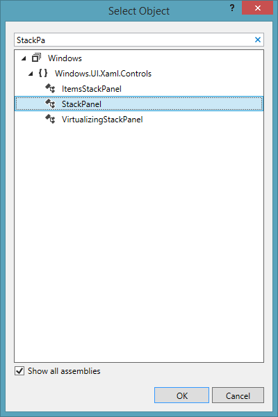
Select StackPanel
In the stackPanel, add a texblock titled “Wanna buy?” and a button named buttonConfirmPurchase and titled “Confirm purchase”. Add a click event handler also to the button.
Next, implement the click event handler for the button:
        private void confirmPurchase_Click(object sender, RoutedEventArgs e)
        {
            Flyout f = this.buttonThirdExample.Flyout as Flyout;
            if (f != null)
            {
                f.Hide();

                textBlockConfirmationText.Text = "You just bought something. Prepare to be charged!!!";
            }
        }
Additionally, in the click event for the “Reset” button, add the following code.
private void buttonReset_Click(object sender, RoutedEventArgs e)
        {
            textBlockConfirmationText.Text = "";
        }
Our final example is also ready. You can run the application and see it in action.
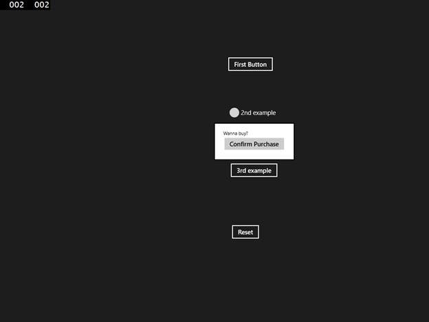
Third Flyout
Once we click on “Confirm Purchase”, you will notice that the status text is changed:
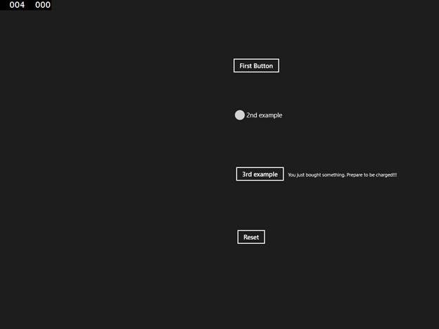
Confirm Changes Status Text
You can click on the “Reset” button and try it again.
Summary
In this article we learned about the new Flyout control and how to use it in your applications. I hope you have found this information useful. If you have trouble following along, a sample code listing is available for download from here.
About the Author
Vipul Patel is a Program Manager currently working at Amazon Corporation. He has formerly worked at Microsoft in the Lync team and in the .NET team (in the Base Class libraries and the Debugging and Profiling team). He can be reached at vipul.patel@hotmail.com