

Introduction
While working on a recent project, I needed to display a notification to the user just like the one you get from Outlook when you receive a new email. Unfortunately, I couldn’t find something very nice working with VS2003 or VS2005. Of course, if you’re using VS2008 you get this for free from MFC, because the feature pack release (integrated in VS2008 SP1) delivers a set of classes for that. But, if you’re not using VS2008, you might have a problem, just like I had. So, I decided to do something about it and the result was a set of classes that can be used to create various styles of alert windows.
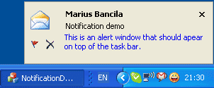
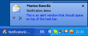
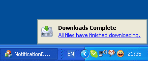
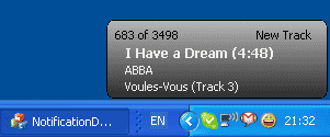
Below are some samples of customized alert windows created with this small framework.
| Simple mail notification | Office 2003-like mail notification |
 |
 |
| Firefox 3 download completed notification | Winamp new track notification |
 |
 |
Framework Description
The classes that form this small framework are grouped in three categories:
-
The alert dialog: The base class for all alert dialogs you want to display and can be customized for the look with styles.
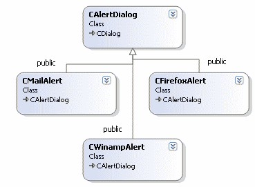
Classes CMailAlert, CFirefoxAlert, and CWinampAlert from the above class diagram are not part of the framework but are sample alert dialogs from the demo application provided for this article.
-
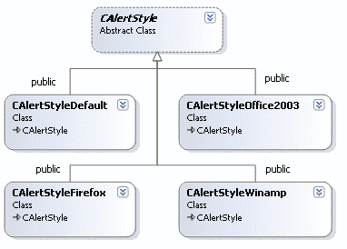
Alert styles: A hierarchy of classes that handle the background and non-client painting for an alert dialog.
-
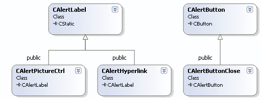
Alert controls: Various custom controls (label, hyperlink, picture control, push button) to be used with alert dialogs.
CAlertDialog
This is a CDialog-derived class and the base class for any alert window you want to display. It has the following features:
- Shows a dialog on top of the task bar with blending animation for showing and hiding
- Uses custom animation and visibility time and transparency level
- Stays active for an indefinite period of time when the mouse is over (in which case, whenever the mouse hovers the window the visibility elapsed time is reset)
- Moves the window with the mouse in the screen bounds (regardless of the number of monitors)
- Can be parameterized with an alert style for painting the background and the non-client area
This class has only three public methods:
- Show(): Shows the dialog with blending animation; you can specify the appearance time, the visibility time, the maximum opacity for the window (255 means fully opaque, 0 fully transparent), and whether the window should remain visible (fully opaque) for as long as the mouse is over it.
- Hide(): Hides the dialog immediately, aborting any animation, if the case.
- SetAlertStyle(): Sets the style object used for handling the background and non-client painting.
OnNcPaint() calls HandleNcPaint() on its style object, and OnEraseBkgnd() calls HandleEraseBkgnd(). When one of these methods returns FALSE, the handling for the event is delegated to the base class (CDialog).
CAlertStyle
This is a base class for all alert styles used to customize an alert window. It has the following virtual methods:
- HandleNcPaint(): Handles the non-client painting for a window.
- HandleEraseBkgnd(): Handles the background painting for a window.
- OnInitialize(): Called for performing any initialization, if necessary, when creating the window.
CAlertStyleDefault
A simple style implementation that does not handle the background erasing and draws a simple edge around the alert window.
CAlertStyleOffice2003
This is an Office 2003-like alert style. It displays a blue gradient background, a black rectangle around the window, and has a small dark blue bar on top of the window.
CAlertStyleFirefox
Creates a window look similar to the Firefox download notification window, with a blue rectangle and a background in the system color COLOR_BTNFACE.
CAlertStyleWinamp
Creates a window look similar to the Winamp new track notification window, with a round black border and a grayscale gradient on the background.
CAlertLabel
This is a static control that has a transparent background. You can set a custom color for the text. By default, this color is black. It uses a cached bitmap to paint the background. When the background behind the control changes, this cache must be invalidated by calling InvalidateCachedBitmap.
CAlertHyperlink
The alert hyperlink is derived from CAlertLabel and provides the following additional features.
- Can have different colors for displaying the text when the mouse is on the control and when it’s not.
- Can underline the text.
- Can have a different cursor when the mouse is over the control.
- Notifies its parent when it is clicked.
CAlertPictureCtrl
The alert picture control (derived from CAlertLabel) displays an image that can be transparent. It has the following features:
- Can display either an icon or a bitmap.
- Can use a transparent color to draw the image.
CAlertButton
The alert button is a push button that has the following features:
- Is always flat.
- Can have a bitmap or icon, which is always displayed in the middle of the client area.
- Can specify a transparent color for drawing the image.
- Can specify a highlighting color for drawing the background when mouse is over the control.
- Notifies its parent when it is clicked.
CAlertButtonClose
The close alert button is an alert button that displays an X sign for closing (and does not require are icon or bitmap resource for that).