Introduction
Infragistics, one of the premier third-party control providers for the .NET framework has sufficient controls that adhere to my common tasks. However, as we say, “One size does not fit all”, the current version too did not fit my requirements.
I had to extend the Infragistics Controls with added functionality, and ease of use. One of the most widely used controls of Infragistics; the “XamDataGrid” was missing some important features according to me. Remember, you are offered state-of-art control library, but with missing common stuff.
So this article will talk about improving the user experience of the “XamDataGrid” control by adding the missing functionality – Manage Columns. Note that this feature is available in the WinForms version as of now.
NOTE: The Infragistics library that this article uses is WPF 2008 vol 2.
The Manage Columns is a user control that has the SourceDataGrid Property. We would assign this with the XAMDataGrid before we show the Manage Columns user control in a Popup Window. The Popup Window is a simple window.
So, let’s walkthrough the steps required to do so:
I have the used the Sample Data and default properties of the XamDataGrid to begin with. We have a button called “Manage Columns” and a XamDataGrid that is bound to Sample Data.
<CODE>
<Button Click=”Button_Click”>ManageColumns</Button><igDP:XamDataGrid Margin=”10,10,10,10″ Name=”xamDataGrid1″ Grid.Row=”1″ VerticalAlignment=”Top” BindToSampleData=”True”>
<igDP:XamDataGrid.FieldSettings>
<igDP:FieldSettings AllowSummaries=”True” AllowGroupBy=”True” />
</igDP:XamDataGrid.FieldSettings>
<igDP:XamDataGrid.FieldLayoutSettings>
<igDP:FieldLayoutSettings />
</igDP:XamDataGrid.FieldLayoutSettings>
</igDP:XamDataGrid>
</CODE>
The following screen shows how it appears in the XAML designer in Visual Studio with the XAML Markup shown above.

Figure 1
The Button has a Click Event associated with it. In this Event handler, we will,
- Create an instance of the Manage Columns user control
- Set the SourceDataGrid property of the Manage Columns user control to our XamDataGrid
- Associate a closing event handler
- Create a new window that can be used as a Popup
- Associate a closing event handler.
- Set the Manage Column user control as content of the Popup window
- Show the Popup window
The code snippet for the Click Event and the Closing Event handlers are shown below. Suitable comments are also added wherever necessary.
<CODE>
private void Button_Click(object sender, RoutedEventArgs e)
{
//Create an instance of the Manage Columns user control.
UCManageColumns manageColumns = new UCManageColumns(_manageColumnTables);
//Set the sourceDatagrid property.
manageColumns.SourceDataGrid = this.xamDataGrid1;
manageColumns.ClosePopUpWindow += new UCManageColumns.ClosePopUpWindowHandler(manageColumns_ClosePopUpWindow);
_manageColumnWindow = new PopUpWindow(“Manage Columns”, (Window)this);
_manageColumnWindow.Owner = (Window)this;
_manageColumnWindow.Closing += new CancelEventHandler(_manageColumnWindow_Closing);
//set the content of popup window as Manage Columns user control.
//show the popup window.
_manageColumnWindow.Content = manageColumns;
_manageColumnWindow.ShowDialog();
}private void manageColumns_ClosePopUpWindow(ManageColumnsData[] manageColumnTables)
{
if (manageColumnTables != null)
{
_manageColumnTables = manageColumnTables;
}
CloseManageColumnsWindow();
}private void _manageColumnWindow_Closing(object sender, CancelEventArgs e)
{
if (_manageColumnWindow != null) _manageColumnWindow = null;
}private void CloseManageColumnsWindow()
{
if (_manageColumnWindow != null)
{
_manageColumnWindow.Close();
}
}
</CODE>
The PopupWindow is just a place holder and contains no XAML or any other controls at all. Look at the screen below of the XAML Designer and the XAML for the Popup window.
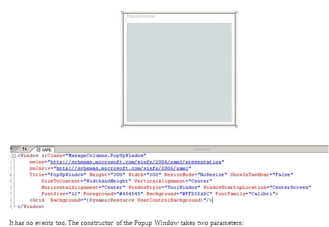
Figure 2
It has no events too. The constructor of the Popup Window takes two parameters:
- Title
- Window
The Title specifies the title of the Popup Window itself and the Window Property is used to set the Owner. The constructor of the Popup window would look like the sample below:
<CODE>

public PopUpWindow(string title, Window parentWindow)

      {

            InitializeComponent();

            this.Title = title;

            this.Owner = parentWindow;

            ((Window)this.Owner).ShowInTaskbar = true;

      }

</CODE>
Now, let’s go to the main part of this solution: The user control for adding the Manage Columns functionality to the XamDataGrid.
There are four controls in this User Controls.
- Place holder for the list of Available Columns
- Place holder for the list of Visible Columns
- An OK button
- A Cancel button
When this user control is loaded, it would have the SourceDataGrid property set. Based on this value, two datasets are created:
- Visible Column Collection
- Available Column Collection
The Manage Column feature allows you swap this column list across and provide a way for the end-user to customize the screen. Note that the user or the application can automatically save these column preferences and then reload it for the user the next time the user comes to this screen.
The four buttons:
- Move all Available to Visible
- Move selected Available to Visible
- Move All Visible to Available
- Move selected Visible to Available
Lets us move the items (columns) between the Available and the Selected. The following are the functions executed on the button clicks:
<CODE>
private void ButtonAllToDestination_Click(object sender, RoutedEventArgs e)
{
SwapColumns(AvailableColumnsGrid, VisibleColumnsGrid, true);
}private void ButtonToDestination_Click(object sender, RoutedEventArgs
{
SwapColumns(AvailableColumnsGrid, VisibleColumnsGrid, false);
}private void ButtonAllToSource_Click(object sender, RoutedEventArgs e
{
SwapColumns(VisibleColumnsGrid, AvailableColumnsGrid, true);
}private void ButtonToSource_Click(object sender, RoutedEventArgs e)
{
SwapColumns(VisibleColumnsGrid, AvailableColumnsGrid, false);
}</CODE>
The rest of code is pretty straight forward and is available in the downloadable solution below.
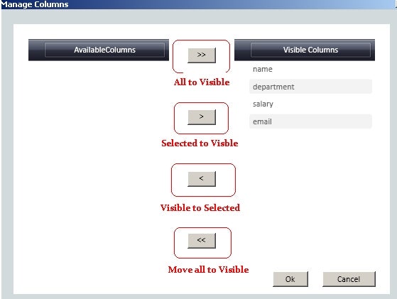
Figuer 3 – Screenshot of the Manage Column Screen for default data.
The screenshots below of the sample application show the various steps involved in search.
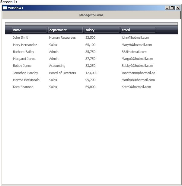
Figure 4 – Screen 1
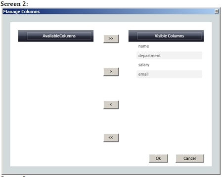
Figure 5 – Screen 2
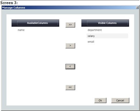
Figure 6 – Screen 3
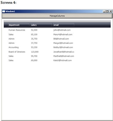
Figure 7 – Screen 4
Thanks for following along, hope you learned something.
Happy Coding!


